VisualizeIt – Tile-Grid Map of Italy
I’m sure you already seen a thematic map before. Especially during elections, we are swamped by this type of data visualisation, comparing numbers for a set of geographic areas (states, regions, neighborhoods…) usually through a colour scale.

Unfortunately, there’s a couple of major issues with this kind of viz:
- differences in extension of areas distort the perception of data
- the irregular shape of regions makes it hard to display information in other ways than colour scales
A couple of years ago, while working for the Information is Beautiful Awards, I came across this wonderful project made by After the Flood.
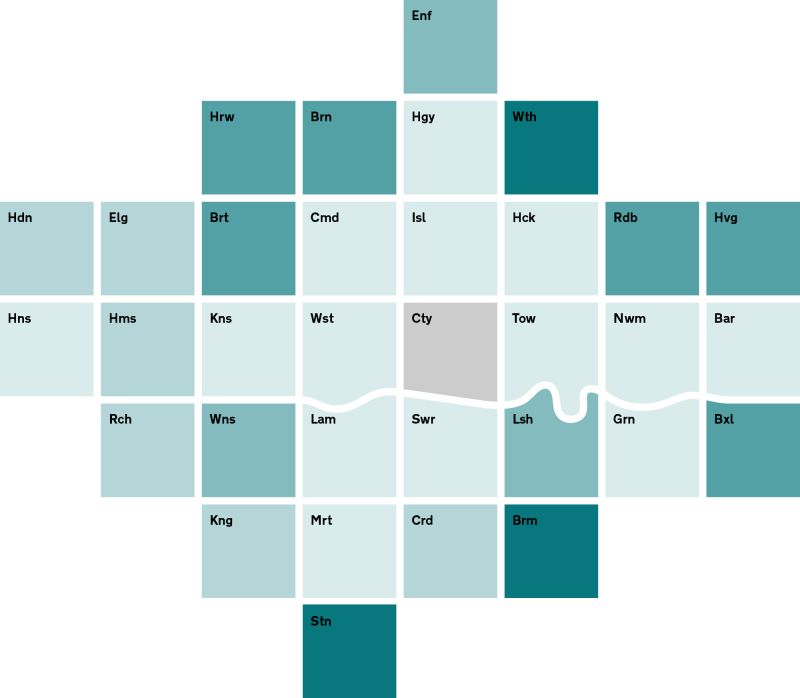
The city of London here is mapped through a tile grid. This allows designers to embed richer information, while eliminating the area size bias.
US, Europe and other similar maps are also commonly used online, so I started wondering if this approach may work for my country, Italy, and its regions.
The project essentially had two constaints:
- To respect as much as possible regions’ real geographic relations.
- Italy’s shape to be immediately identifiable

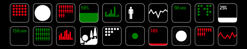
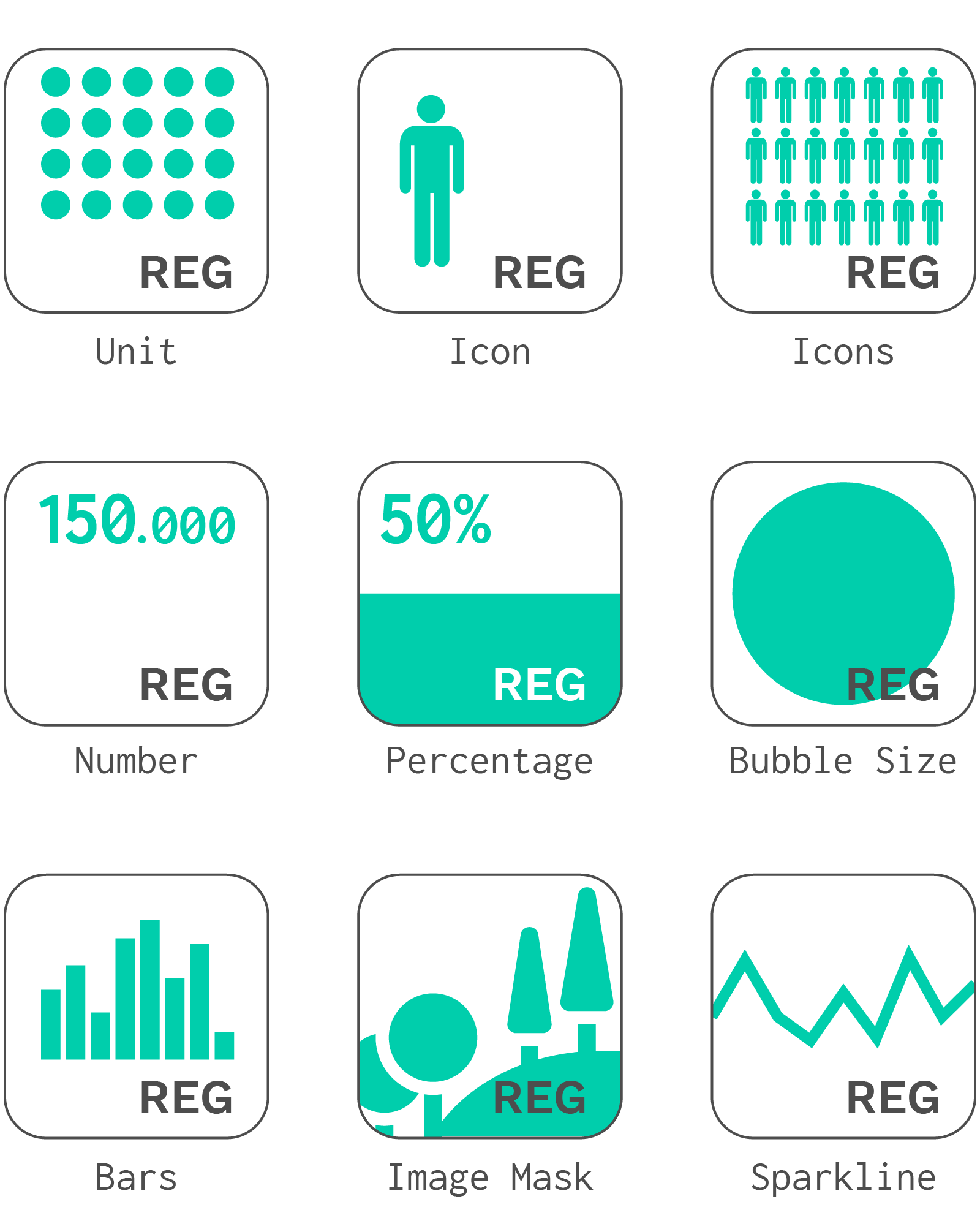
I also started to develop a set of potential ways to use the map, trying to include as many options as possible, while trying to keep it simple and easy to read, especially for social networks.
The best way to check if the project is functional has been experimenting directly with real data: I’ve created a Facebook Page (in Italian) for this aim, and during the next months I’ll publish a simple map every Monday.
The final result is a data tour of Italy, includiung information and statistics about many different themes: some are funny and curious, others are serious or even scary, each one tells a short story about the country.
Questions? Ideas? Feedback? Let’s get in touch.
[ I’m thinking about releasing a vector file of the map for everyone to use it, if you are interested, let me know. ]